5 Most Common Mistakes Designers Make on Their Website
Jan 28, 2022
Listen, no one’s perfect okay. Babe Ruth, arguably the most famous baseball player of all time struck out 1,330 times. And if you don’t know anything about baseball, let me just tell you that that’s a whole lot of times to strikeout. And yet, he was also one of the best. When asked about his strikes, all he ever said was “Every strike brings me closer to a home run.” So if you find that you’ve made all five of the following mistakes, don’t be so hard on yourself and remember…
“Never let the fear of striking out, keep you from playing the game.” - Babe Ruth
Alright, enough with the quotes, let’s get on to why you actually clicked on this article. I hope that we can all agree that as an interior designer, your website is everything. It’s the equivalent of your design firm's driver’s license and this website police is looking for identification.
Too often I’ve come across design websites that just aren’t cutting it. From horrible loading times to not even including any contact information, I just couldn’t bear to see another designer make the same common mistakes. So with that said, hopefully, these tips will help you avoid them and optimize your website for the best conversions and traffic.
1. Not Being Active by Adding Fresh Content Consistently
This one might be the most common mistake yet but just like with your social media platforms, your website also needs constant attention. Some people say having a business is like having a baby, so think of your website as your baby’s diapers… you’re going to want to change them consistently. If someone stumbles across your website and sees that the last project you featured on your site was from 2004, they’re going to wonder whether you’re even still in business.
There’s a common misconception that a website is one and done, which couldn’t be further from the truth. Whether you create your own or hire a web designer to create it for you, your website is still going to need fresh new content and constant updates, and here’s a couple of reasons why:
- Every time you add content to your website, there are keywords and phrases that you should be using, which in turn optimizes your SEO and increases your chances of appearing in search engines.
- Another key reason it’s important to add new content is that Google loves updates. They want to keep their customers up to date with the latest products and services, so if they notice your website hasn’t had an update in the past year, this will hurt the traffic that’s driven to your website.
With these few important notes about fresh content, I hope you understand how detrimental not adding content frequently can be.
2. No SEO To Be Found
As much as adding fresh content can help attract new visitors to your site, it’s not the same as optimizing your website for SEO, or rather Search Engine Optimization.
Search Engine Optimization: The process of maximizing the number of visitors to a particular website by ensuring that the site appears high on the list of results returned by a search engine. (Definition from Oxford Languages)
As an interior designer, you require clients often and one of the best ways to get to your target market is by ensuring that you’re seen when they search for interior designers on Google. SEO ensures that if someone uses a certain term in your field, for example, "Modern Interior Designer," you get to appear within the search results, and might even be the first Google suggestion depending on the keywords you used.
A website that’s been search engine optimized will:
- Increase the organic traffic your site receives
- Improve your Google visibility and rankings
- Increase your lead generation
- Build trust with your customers
If you’re familiar with the way algorithms work on Instagram, Facebook, and other social platforms then you already have a basic understanding of how SEO works. It’s like using hashtags versus not using hashtags. If you use the right ones on Instagram, the chances of your content appearing on the discovery page are much higher compared to when you don’t.
In addition to keywords, a good rule of thumb for SEO is optimizing your image Alt text and image description. You want to make sure you are changing the name of your images and image description to a title that correlates with what you do.
For instance, if I’m using a stock image on my website I’d go ahead and change the image’s original name to a title that relates to my business, like so:

If you need a more in-depth understanding of SEO and how you can use it to your advantage, I encourage you to read the following:
The Ins and Outs of SEO - What Interior Designers Need To Get Started
3. Not Capturing Visitor’s Information
The whole purpose of setting up a website is to ensure that there is a constant flow of leads. So, not capturing the information of any visitor that stops by your website is a mistake I wish more interior designers avoided.
There are many reasons why it’s important to capture your visitor's information, here are a few:
- Gathering contact information from prospects produces stronger leads.
- You can use that data to break down where your traffic is being generated from. For instance, include a section in the contact form that asks “How did you hear about us?”
- You get to learn more about your audience, what they like, and what they are looking for.
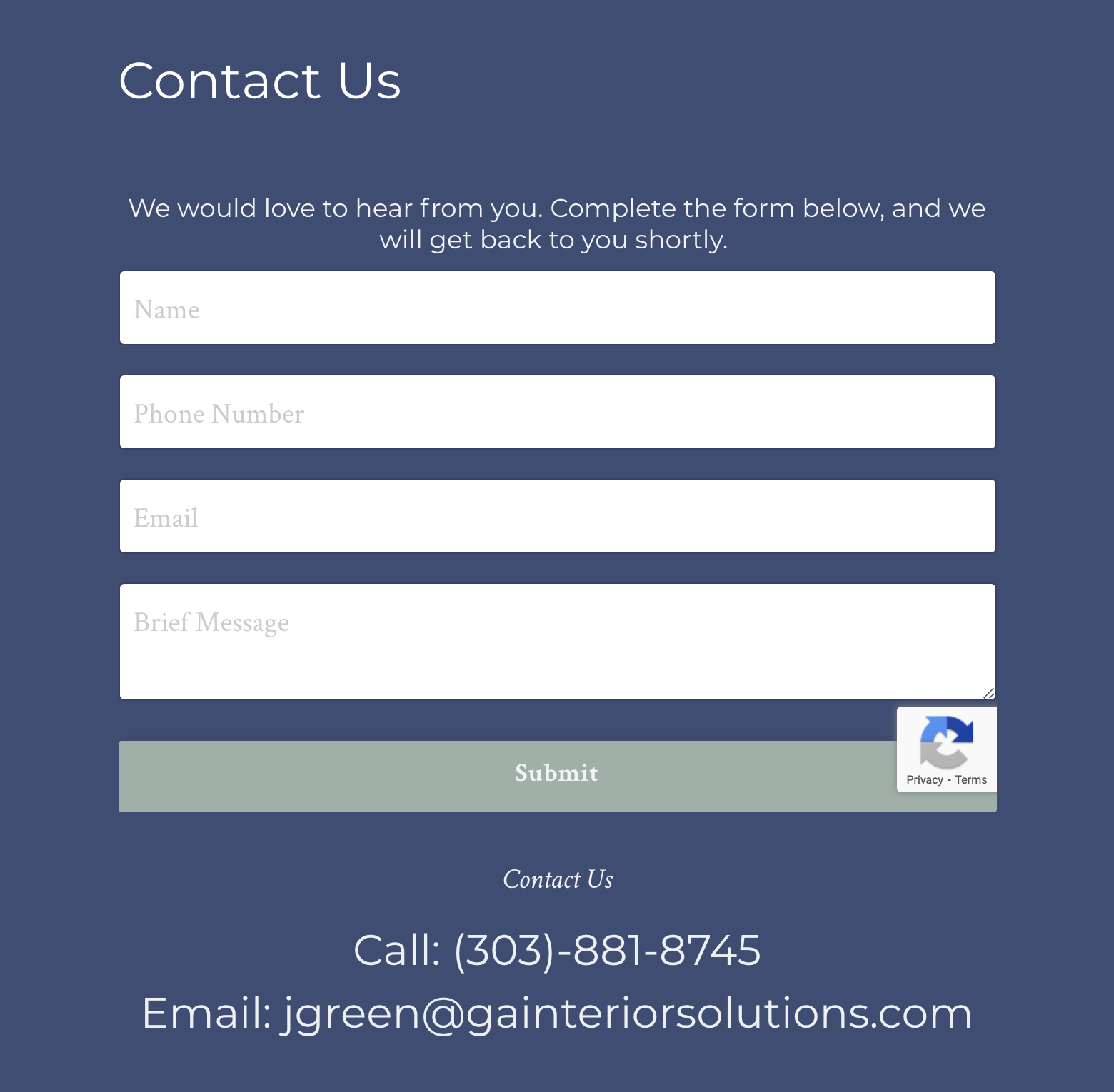
Instead, use a form to help you capture this information. The form can be embedded on your website or it can even pop up.
4. Failure To Include a Lead Magnet To Encourage Signups
As I shared with the Behind the Design community in a recent article, there are many reasons why lead magnets work. The immediate goal of a lead magnet however is to get email subscribers. There are only so many people that will engage with your content enough that they’ll subscribe to your list in order to receive emails from you.
The reality is that a lot of people will simply read a bit and then leave, whereas a lead magnet is designed to encourage a portion of those people to give you their contact information for later follow-up. Needless to say, lead magnets are great tools to help you capture the information of a visitor on your website, so why wouldn’t you include one on your website?
Here’s an example of a great lead magnet that converts:
5. Forgetting To Create a Mobile-Friendly Website
One of your top priorities for website development should be to create the best possible experience for your users and a huge portion of this experience will take place on your user’s mobile devices. According to Statista, mobile accounts for approximately half of the web traffic worldwide. In the first quarter of 2021, mobile devices (excluding tablets) generated 54.8 percent of global website traffic, consistently hovering around the 50 percent mark since the beginning of 2017. So if you’re forgetting to create a mobile-friendly website, that’s half of your website traffic that you’re either missing out on or simply pushing away due to a very wonky-looking mobile site.
That’s not all either. According to Vertical Leap:
- Google rewards mobile-friendly sites and penalizes the not-so-friendly
- Various studies show users don’t return to a website after a bad experience
- That means poor mobile experience could cost you 53% of visitors
- Today’s consumers move between multiple devices, making a consistent experience increasingly important
Related Article: 8 Easy Steps to Converting Leads on Your Interior Design Website
With that said, here’s how you can make your interior design site mobile responsive:
Google offers a free online course called Responsive Web Design Fundamentals, which is great if you want to get into the nitty-gritty of how to design and code responsive pages on your own. But, because your time as an interior designer and business owner is already limited, there’s a much simpler way to go about this and that’s hiring a team of experts to take care of this for you. This will no longer be free but I guarantee you that this will cost you a lot less than not having a mobile-friendly site.
I borrowed the following information from Vertical Leap to help you understand what a good responsive mobile site should include:
- Prevent horizontal scrolling on mobile
- Deliver the same content on all devices
- Ensure text is legible on all devices (size, contrast, etc.)
- Ensure content is visible in all conditions (think about bright light outdoors)
- Provide an intuitive navigation menu for mobile devices
- Be fully optimized for touch on mobile (clickable elements large enough for finger touches, no mouse-hover interactions)
- Provide a consistent experience across all devices so users can move from mobile to desktop and know where everything is
Final Thoughts
I encourage you to take some time out of your schedule and go over your website. Review your existing site, make notes of the things you'd like to improve, and incorporate the tips I've mentioned in this article.
You've made such a powerful decision of not only being an interior designer but also an entrepreneur and that's something that I'm so proud of you for. So take things step by step, focus on your priorities, delegate tasks to team members if needed, and before you know it you'll be hitting home runs too.
Sign Up for Our Monthly Newsletter
Get helpful career, business, and design tips right in your inbox each month.
At Behind the Design, we are committed to building a stronger design community by reimagining education, training, and support for interior designers. Through our various software training options, educational articles covering everything from leadership to marketing, and soon Continuing educational courses, we are committed to helping you. Join our newsletter to get the latest education and training updates.

